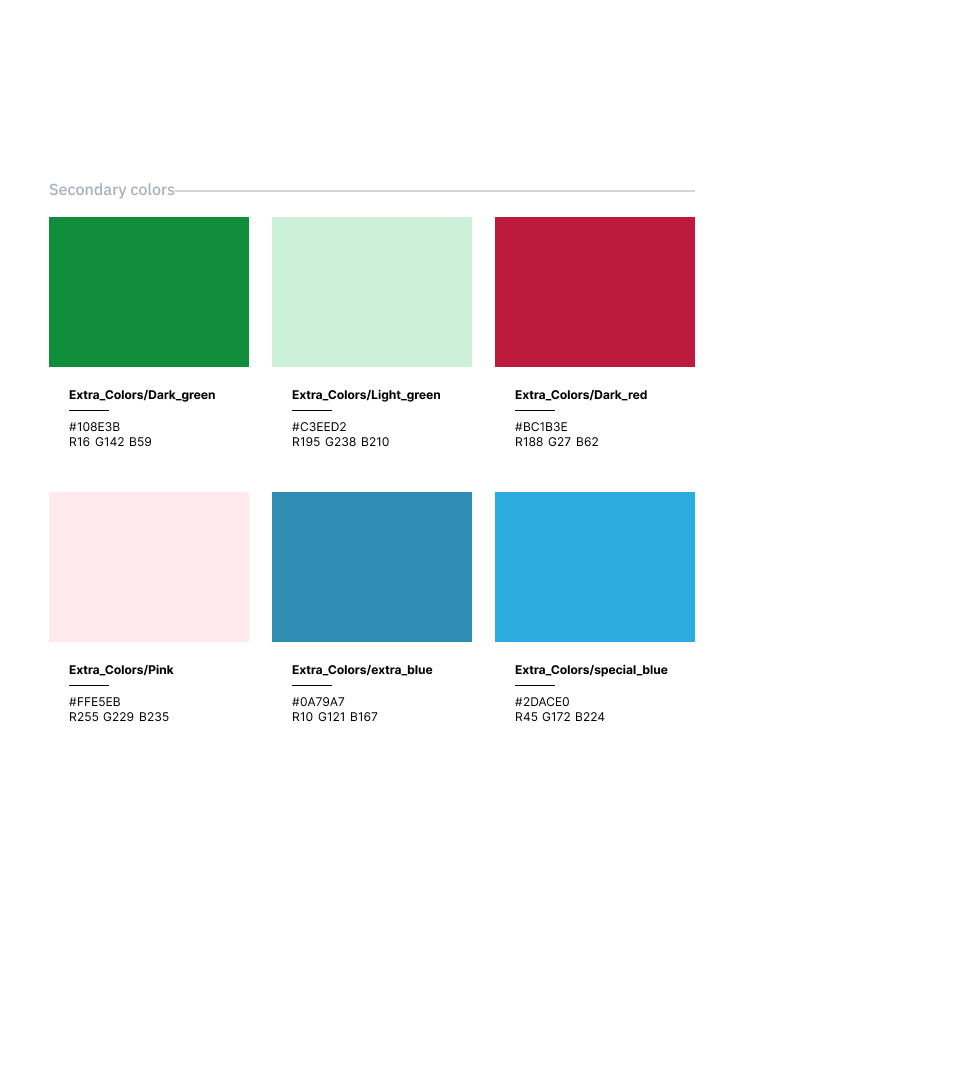
For a solid and professional look, I crafted a color palette featuring calming shades of blue, gray, and white. Additionally, high-contrast muted tones were incorporated to effectively grab the user's attention.
Three special gradients have also been included, two of which were derived from the tones of the company logo gradient.


